
Usability testing for the Royal Opera House website
Usability testing for the Royal Opera House website
Usability testing for the Royal Opera House website
In the heart of London's cultural scene, the Royal Opera House (ROH) stands as a symbol of artistic excellence. However, its digital presence needed evaluation to ensure it effectively serves both seasoned patrons and newcomers. I undertook the challenge of conducting a thorough usability test of the ROH website to uncover insights into user experience and identify areas for improvement.
In the heart of London's cultural scene, the Royal Opera House (ROH) stands as a symbol of artistic excellence. However, its digital presence needed evaluation to ensure it effectively serves both seasoned patrons and newcomers. I undertook the challenge of conducting a thorough usability test of the ROH website to uncover insights into user experience and identify areas for improvement.
Scroll to explore

Client:
Client:
Royal Opera House
Royal Opera House
Dates:
Dates:
February - March 2023
February - March 2023
Role:
Role:
UX Researcher
UX Researcher
Skills:
Skills:
Usability Testing, Remote Moderated Evaluation, SUPR-Q
Usability Testing, Remote Moderated Evaluation,
SUPR-Q
Usability Testing, Remote Moderated Evaluation, SUPR-Q
The challenge
The challenge
The Royal Opera House sought to understand how well their website performed, particularly for users unfamiliar with opera and ballet. They aimed to ensure that the site effectively promoted ticket sales for various performances and facilitated essential user journeys, including making donations and booking restaurants.
The Royal Opera House sought to understand how well their website performed, particularly for users unfamiliar with opera and ballet. They aimed to ensure that the site effectively promoted ticket sales for various performances and facilitated essential user journeys, including making donations and booking restaurants.
The goal
The goal
My objectives for this project were clear:
Evaluate the overall user experience of the Royal Opera House website
Assess how effectively the homepage communicates ROH's purpose and offerings
Investigate the usability of key user journeys, including finding streaming options and behind-the-scenes information
Identify areas for improvement to enhance user satisfaction and support business goals
The process
The process
Methodology
Methodology
I conducted remote moderated usability testing sessions with 5 participants (1 frequent user and 4 occasional users) using Zoom and Microsoft Teams. Participants were asked to complete 7 tasks designed to address ROH's key business goals and user journeys:
Homepage impression test
Finding streaming options for at-home viewing
Locating cinema performances
Discovering behind-the-scenes activities
Finding dining options
Making donations
Accessing visitor information for first-time attendees
During testing, I encouraged participants to think aloud while completing tasks, allowing me to gather both quantitative and qualitative data, including task success rates and user feedback.

Example of the tasks
Example of the tasks
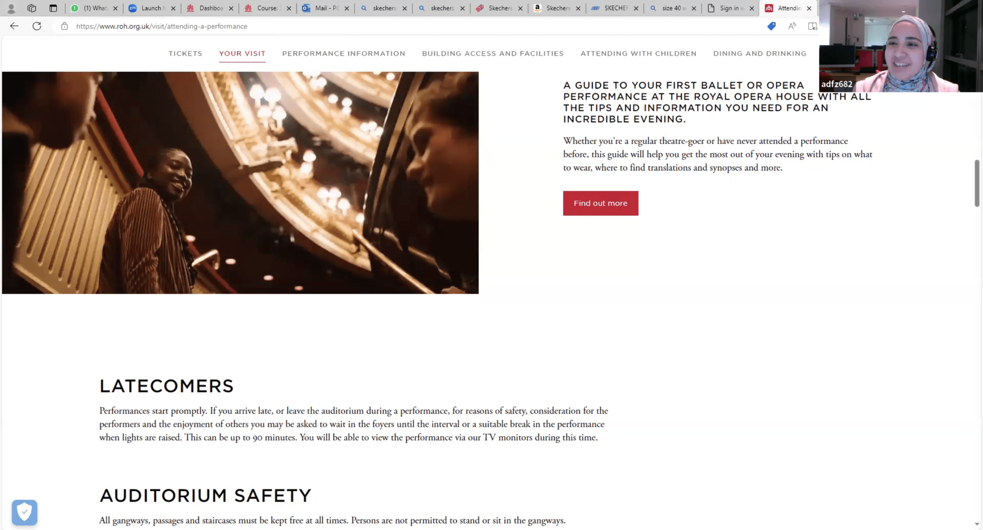
Photo from the usability session
Photo from the usability session
In terms of quantitative metrics , scores were calculated for each participant using the online PSSUQ calculator, which can be subsequently broken down into more detailed composite scores:
Overall: the average scores of questions 1 to 16;
System Usefulness: the average scores of questions 1 to 6;
Information quality: the average scores of questions 7 to 12;
Interface quality: the average scores of questions 13 to 15;
Data Analysis
Data Analysis
After transcribing all recording sessions, I conducted an inductive thematic analysis using Optimal Workshop. This approach allowed me to identify recurring themes and patterns in the user feedback without preconceived categories. Each participant was assigned a unique color, and I used this color-coding strategy to mark feedback or user actions indicative of usability problems. This method helped me differentiate the input and experience of different users, simplifying the process of identifying common issues across participants.
Following this analysis, I created a rainbow spreadsheet to track problems identified across various user journeys. Here's an example of how it looked:

Each issue was assigned a severity rating based on Nielsen (1994)'s Four-Step Severity Scale:
Each issue was assigned a severity rating based on Nielsen (1994)'s Four-Step Severity Scale:

Results
Results
Homepage Effectiveness
Homepage Effectiveness
All participants recognized the website as belonging to the Royal Opera House. They identified its main purposes as selling tickets for performances and providing information about current events. The visual style and content structure received positive feedback.
All participants recognized the website as belonging to the Royal Opera House. They identified its main purposes as selling tickets for performances and providing information about current events. The visual style and content structure received positive feedback.
Overall User Experience
Overall User Experience
Task success rates were high for most tasks, except for finding behind-the-scenes tours, which proved challenging due to unintuitive labeling in the global menu. The PSSUQ scores indicated good overall satisfaction but highlighted concerns about information quality.
Task success rates were high for most tasks, except for finding behind-the-scenes tours, which proved challenging due to unintuitive labeling in the global menu. The PSSUQ scores indicated good overall satisfaction but highlighted concerns about information quality.
Key User Journeys
Key User Journeys
Alternative ways of engaging with performances: Participants easily found streaming options but noted a lack of clear subscription details.
Watching performances in local cinemas: Users struggled with outdated information and filtering options.
Behind-the-scenes activities: This task had the lowest success rate, indicating issues with labeling and information architecture.
Other journeys (dining, donations, visitor information): These tasks were generally completed successfully.
The Solution
The Solution
Based on my analysis, I identified several key areas for improvement:
Enhance labeling in the global menu to improve findability of behind-the-scenes content.
Improve layout consistency across pages to reduce user confusion.
Provide clearer information about subscription details and content.
Optimize cinema performance search functionality with better filtering options.
Reflection and Conclusion
Reflection and Conclusion
Conducting this usability testing project for the Royal Opera House website provided invaluable insights into user behavior and preferences. While the site generally performs well, there are clear opportunities for enhancement, particularly in information architecture and search functionality.
By addressing these issues, ROH can create a more intuitive experience for both new and returning visitors, ultimately supporting their goals of increasing engagement and ticket sales. This project not only reinforced my understanding of user-centered design but also highlighted my ability to conduct independent research that can lead to meaningful improvements in digital experiences.
As I reflect on this journey, I am excited about how these insights can shape the future of the Royal Opera House's digital stage, creating an encore-worthy online experience for all who visit.
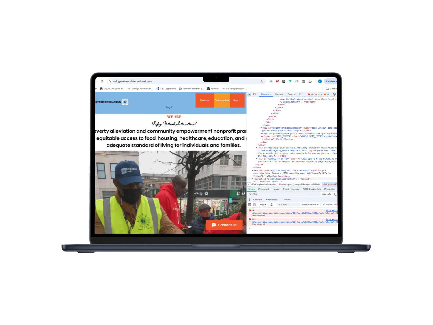
Web Accessibility Audit for Refuge Network International
September - November 2023
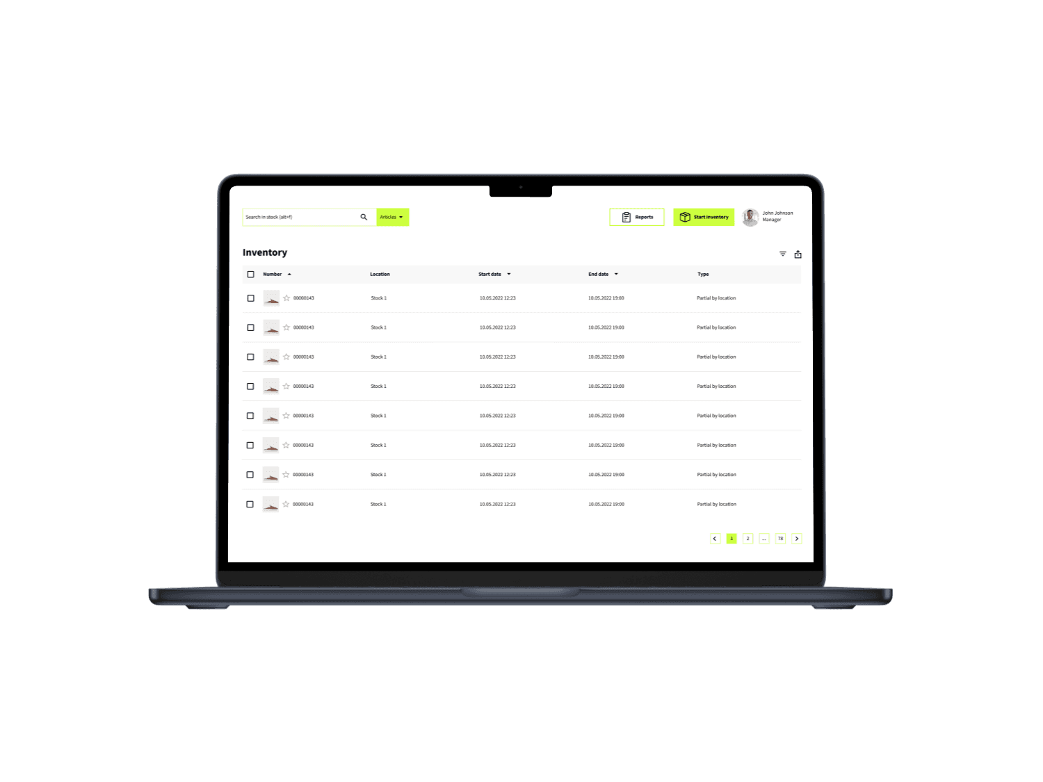
A Web Solution for Real-Time Stock Tracking
February - May 2022
You may also like
You may also like
You may also like